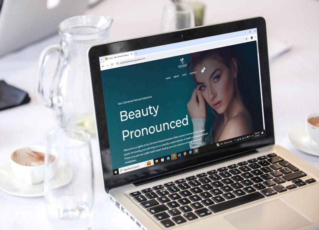
Sanclement Natural Solutions
Project Overview
Key Features of the Project:
-
- Clean, User-Friendly Design: Focuses on simplicity and easy navigation.
- Natural, Eco-Conscious Theme: Reflects the company’s commitment to sustainability.
- Mobile Responsiveness: Optimized for all device types, ensuring a seamless experience.
- Fast Loading Times: Prioritized for both user satisfaction and SEO benefits.
- Secure Payment Gateways: Provides trust and transparency in online shopping.
- Clear Product Categorization: Makes browsing and purchasing easy and intuitive.
- Engaging Visuals: Large images and a natural color palette enhance user experience.
Our Approach
The design strategy was simplicity and clarity, achieved through a clean layout to provide focus on user experience. We used pictures, backdrop colors, and call-to-action buttons which blatantly guided visitors around the site. This design was optimized for fast browsing of product information and smooth transitions between pages. Mobile responsiveness was prioritized, to make sure that any user on their device will have a consistent experience.
Additionally, the website is created to be fast-loading – thus enhancing user experience and SEO rewards. We included safe payment gateways and detailed product descriptions to make sure the trust is never broken. This natural, eco-friendly theme was then complemented through the placement of content and images as well as categorization.
The Result
As a result, we created a user-friendly and polished website that echoes San Clemente Natural Solutions’ commitment to sustainability as well as customer service. For users, it was easy to navigate ordering the product and read some great educational content. It helps in creating a feeling of involvement on the part of the user, and trust for the brand as is evident from improved feedback by customers leading to more conversions. This site perfectly encapsulates health, beauty, and environmental responsibility.


